The News on Wikipedia in 2014
It’s that time of year when everyone writes either a year-in-review article or a predictions-for-next-year article. The Wikimedia Foundation offered one of their own that showed the remarkable capacity of Wikipedia to support collaborate around current events.
As many of you know, my dissertation examined how Wikipedia covers breaking news events. I’ve remained interested in this topic and I was very excited to see the Wikimedia Foundation prominently acknowledge this use case.
In this post I want to go deeper and look at what happened on Wikipedia around current events this year. These data are so rich and multifaceted, they can speak to all kinds of different research questions that are beyond the scope of a dissertation, much less a blog post, to fully explore. Such questions can look at several different kinds of data at several different levels of analysis: changes in an article’s text over time, differences contribution patterns between articles, differences between different languages’ articles about the same events. The precipitating events and consequences following any given news story are complex, but there are nevertheless patterns in our attention to these events and Wikipedia’s responses to them. A central question I wanted to explore was how different news events translated into different levels of editorial and popular attention on Wikipedia: As judged by the “wisdom of crowds” of Wikipedia editors across 19 languages, what were the top stories in 2014?
The data
As remarkable as Wikipedia is as a collaborative endeavor, it’s likewise peerless as a data source. Every single change to every single article going back to 2002 is not only public, but also easily accessible through a powerful API with very generous permissions and rate limits compared to the ever-shrinking scope of what other platforms like Twitter and Facebook provide. Couple this with the fact that Wikipedia has records going back to 2002 and you have a social media data source that was not only internationally popular a half-decade before Twitter was a household name, but has continued to remain relevant (though facing strong headwinds on many fronts). Nevertheless, a Wikipedia researcher analyzing a breaking event is likely to be much less stressed than a Twitter researcher owing to the fact that the data quickly becomes difficult to access post hoc for the latter.
Take for example, how perceptions of presumptive U.S. presidential candidate Hillary Rodham Clinton have changed over time. On Wikipedia, you can look at every change made to her article since it was created in 2001. In addition to this longitudinal textual data, there’s also metadata about who has edited what and when as well as “paradata” about the larger context of discussions and regulations of editing behavior. Also throw in the fact that there are different language editions of Wikipedia, each of which having a different take on her. On Twitter you can try to track tweets that match keywords but getting historical data will be technically and/or financially expensive.
For this analysis I used a pure-Python workflow to scrape, structure, clean, and visualize the data. On top of Anaconda, I used the python-wikitools library as a Pythonic wrapper around the Wikipedia API, pandas to handle data formatting and manipulation, seaborn to prettify the default Matplotlib visualizations and do LOWESS fitting, and Gephi for the social network visualizations. All the code is available as an IPython Notebook (view it here) with some additional diagnostics and documentation included and the data I’ve scraped for this analysis is available on my GitHub repo for this project. Personally, my big win from this project was getting pretty dangerous at manipulating and customizing Matplotlib figures that are spit out of plotting functions in pandas and seaborn. Sure it’s mundane, but I think data viz is an important skill and hopefully you find the figures here interesting 🙂
Cross-language comparisons
I began by scraping all the “zeitgeist” report content for January through October 2014 across 19 language editions of Wikipedia. This zeitgeist ranking sorts articles based on the number of unique editors they had in each month. I then took the zeitgeist rankings for 18 Wikipedia languages with the most pageviews after English (Russian, Spanish, German, Japanese, French, Chinese, Italian, Polish, Portugese, Dutch, Turkish, Arabic, Swedish, Indonesian, Korean, Czech, Farsi, and Ukranian). The articles listed in the table below are sorted by the total number of editors across months in the top 25 multiplied by the number of months in the zeitgeist list for January through October.
| 1 | 2 | 3 | |
|---|---|---|---|
| Arabic | كريستيانو رونالدو | ريال مدريد | السعودية |
| Chinese | 世間情 | 太陽花學運 | 马来西亚航空370号班机空难 |
| Czech | Válka na východní Ukrajině | Euromajdan | Minecraft |
| Dutch | Lijst van personen overleden in 2014 | Malaysia Airlines-vlucht 17 | Eurovisiesongfestival 2014 |
| English | Deaths in 2014 | Malaysia Airlines Flight 370 | Islamic State of Iraq and the Levant |
| Farsi | دولت اسلامی عراق و شام | ایل ملکشاهی | مهران مدیری |
| French | État islamique (organisation) | Manuel Valls | Dieudonné |
| German | Krise in der Ukraine 2014 | Alternative für Deutschland | Fußball-Weltmeisterschaft 2014 |
| Indonesian | JKT48 | NET. | Joko Widodo |
| Italian | Juventus Football Club | Campionato mondiale di calcio 2014 | Serie A 2013-2014 |
| Japanese | 仮面ライダー鎧武/ガイム | 烈車戦隊トッキュウジャー | ハピネスチャージプリキュア! |
| Korean | 대한민국 | 일베저장소 | 세월호 침몰 사고 |
| Polish | Robert Lewandowski | 2014 | Euromajdan |
| Portugese | Em Família (telenovela) | Copa do Mundo FIFA de 2014 | Campeonato Brasileiro de Futebol de 2014 – Sér… |
| Russian | Список умерших в 2014 году | Вооружённый конфликт на востоке Украины (2014) | Донецкая Народная Республика |
| Spanish | Copa Mundial de Fútbol de 2014 | Podemos (partido político) | Copa Sudamericana 2014 |
| Swedish | Sverigedemokraterna | Avlidna 2014 | Feministiskt initiativ |
| Turkish | Türkiye | Recep Tayyip Erdoğan | Mustafa Kemal Atatürk |
| Ukranian | Війна на сході України | Небесна сотня | Ленінопад |
Top Zeitgeist Articles in 2014 across 19 languages
I don’t read or speak most the vast majority of these other languages, so trying to rank the top articles across languages would seem to require passing all of these titles into Google Translate and then trying to manually map the translations onto similar topics—a messy and culturally fraught process. Alternatively, I could just adapt a method my former Northwestern labmates Patti Bao and Brent Hecht used to translate Wikipedia articles by following Wikipedia’s inter-language links. Scott Hale at the Oxford Internet Institute has also done some brilliant work around multilingual Wikipedians. Basically, multilingual Wikipedia editors can link from the English article about the “2014 FIFA World Cup” to the Spanish article “Copa Mundial de Futbol de 2014” which are the same topic and concept but follow different naming conventions in each language.
For each of the over 100 top articles for each of the 18 languages I crawled the inter-language links to try to connect each language’s most-edited articles to articles in other languages. Unfortunately these links across language versions are incomplete (an article about the topic/concept doesn’t exist in other languages) or imperfect (language A links to the concept in language B but B doesn’t link back to A). In the figure below, each row corresponds to the top articles for that language and each column is the rank of an article. Cells are red when the article in that language has a link to an article in English and purple when there’s no English-language article for that language’s top article. I’ve ranked the rows based on how much English coverage they have: Italian has English-language articles for 95 articles in its top 100 list while Indonesian only has English-language articles for 55 articles in its top 100 list.
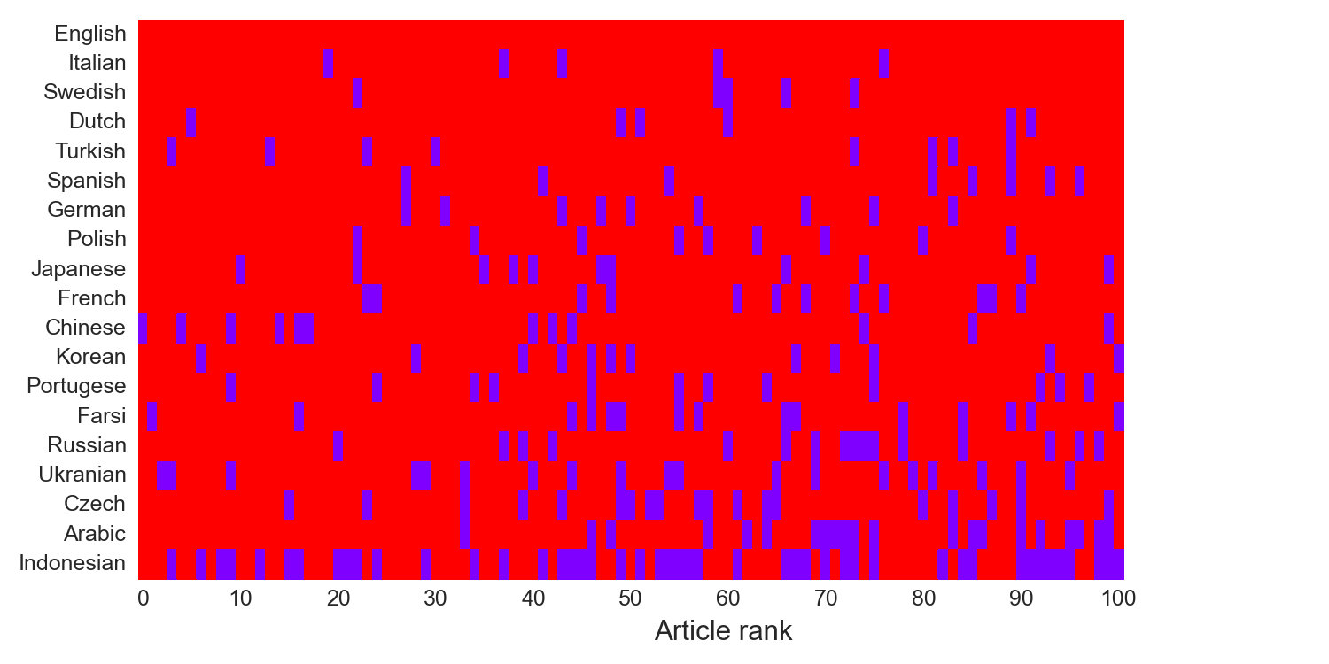
Note that this is not saying that English and Italian have similar top 100 lists, only that the concepts in the Italian Wikipedia’s most-edited articles of 2014 also tend to have corresponding English Wikipedia articles. In other words, English and Italian have similar coverage in the topics and concepts they talk about while English and Indonesian have very different coverage. As this is an admittedly Anglo-centric perspective, we could measure whether the concepts in the Italian zeitgeist list also have articles in Farsi, Ukranian, or any of the other 18 languages here. Instead of showing all of these charts, I’m going to aggregate them all together into one image where the cell values correspond to the number of other languages that also have an article about that topic/concept. The rows have been ranked by how many languages have articles about its concepts: concepts in the Spanish and Italian Wikipedias’ 2014 zeitgeist lists also have corresponding articles in more other languages than the concepts in the Indonesian and Chinese 2014 zeitgeist lists. Put another way, Spanish editors were contributing to articles with greater international appeal than Indonesian editors.
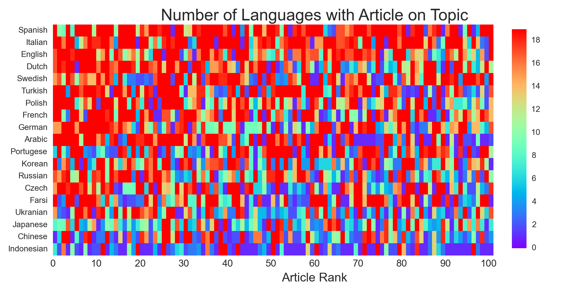
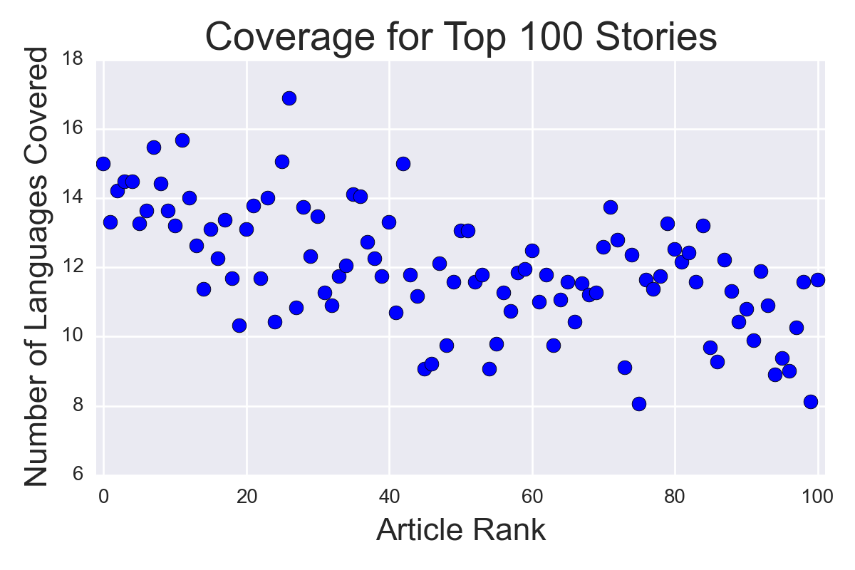
Reading the chart from left-to-right, there’s a general trend for the top zeitgeist articles in a given language to be present across many other languages and lower zeitgeist articles to be more rare. This is born out more clearly in the chart below where the top ranked article across all languages had coverage across 15 other languages on average but the 100th-ranked article had coverage across only 12 other languages on average. This suggests that the ranking of top articles in each language are meaningful in terms of differentiating stories of narrow versus broad interest.
Having “translated” these top zeitgeist articles by following inter-language links, I can reproduce the top 3 zeitgeist table from above, but using English-language concepts. There’s some really fascinating variance in terms of the topics that attracted the most attention across each language: the Arabic Wikipedia appears consumed with Cristiano Ronaldo and Real Madrid rather than current events while Russian Wikipedia is focused on the events in the Ukraine. There are likewise local topics that “Ilbe Storehouse” 4chan-like website in Korean or the “Sunflower Student Movement” in Chinese that will likely be omitted from most Anglophone year in review lists.
| 1 | 2 | 3 | |
|---|---|---|---|
| Arabic | Cristiano Ronaldo | Real Madrid C.F. | Saudi Arabia |
| Chinese | NaN | Sunflower Student Movement | Malaysia Airlines Flight 370 |
| Czech | War in Donbass | Euromaidan | Minecraft |
| Dutch | Deaths in 2014 | Malaysia Airlines Flight 17 | Eurovision Song Contest 2014 |
| English | Deaths in 2014 | Malaysia Airlines Flight 370 | Islamic State of Iraq and the Levant |
| Farsi | Islamic State of Iraq and the Levant | NaN | Mehran Modiri |
| French | Islamic State of Iraq and the Levant | Manuel Valls | Dieudonné M’bala M’bala |
| German | War in Donbass | Alternative for Germany | 2014 FIFA World Cup |
| Indonesian | NaN | NaN | Joko Widodo |
| Italian | Juventus F.C. | 2014 FIFA World Cup | 2013–14 Serie A |
| Japanese | Kamen Rider Gaim | Ressha Sentai ToQger | HappinessCharge PreCure! |
| Korean | South Korea | Ilbe Storehouse | Sinking of the MV Sewol |
| Polish | Robert Lewandowski | 2014 | Euromaidan |
| Portugese | Em Família (telenovela) | 2014 FIFA World Cup | 2014 Campeonato Brasileiro Série A |
| Russian | Deaths in 2014 | War in Donbass | Donetsk People’s Republic |
| Spanish | 2014 FIFA World Cup | Podemos (Spanish political party) | 2014 Copa Sudamericana |
| Swedish | Sweden Democrats | Deaths in 2014 | Feminist Initiative (Sweden) |
| Turkish | Turkey | Recep Tayyip Erdoğan | Mustafa Kemal Atatürk |
| Ukranian | War in Donbass | List of people killed during Euromaidan | NaN |
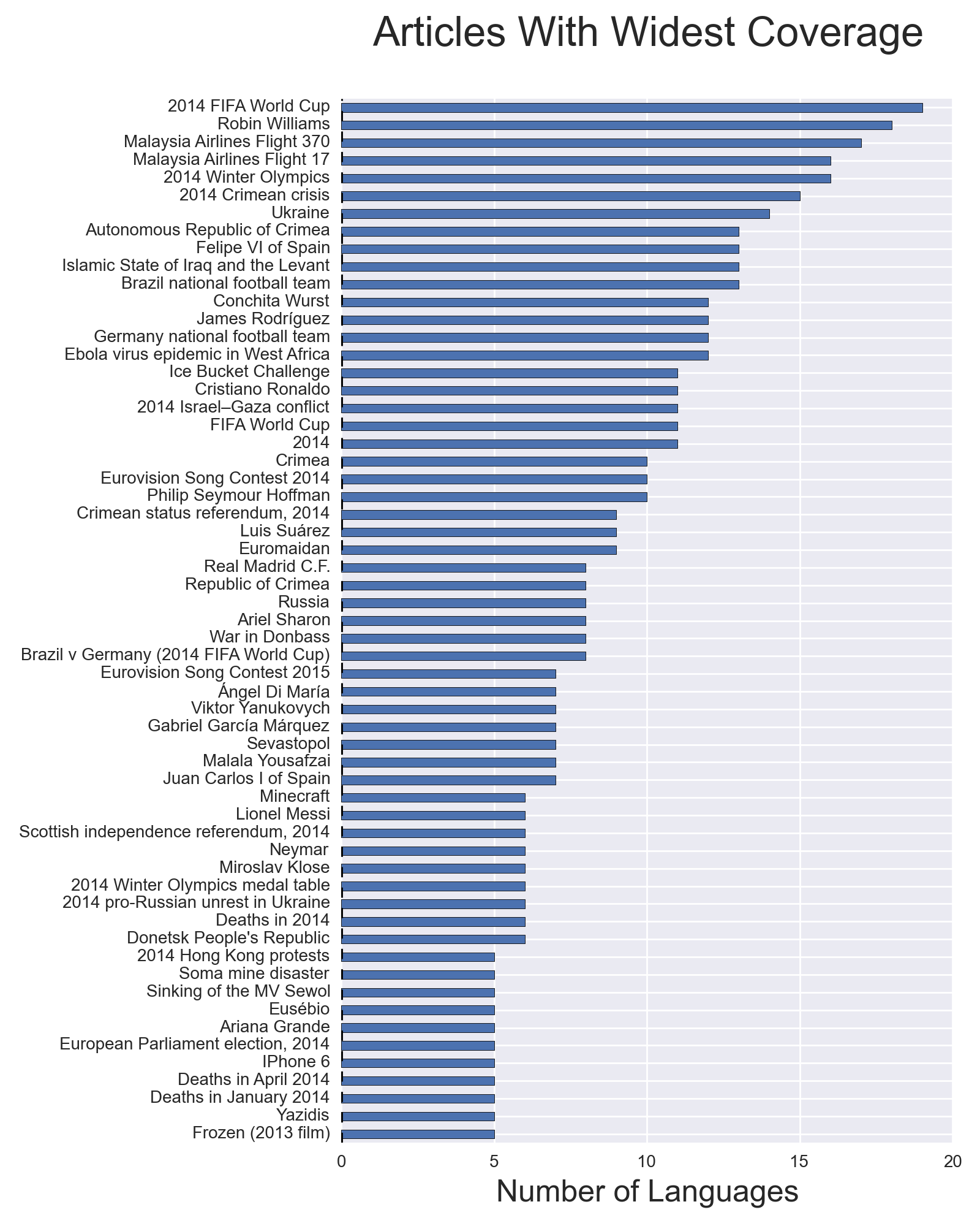
Now that (most) concepts across different languages have been mapped to English-language (or any other language) concept, we can begin to rank them. The first ranking sorts articles based on (1) appearing in some language’s zeitgeist list and (2) on the number of languages having an article about that topic (for brevity, the figure below only includes articles that appear in 5 or more languages). Again, it’s important to remember that the method I’ve used here is not to select articles that were created in 2014, but rather only to look at those articles that were most heavily-edited across languages which reflects a really profound and interesting bias towards current events.
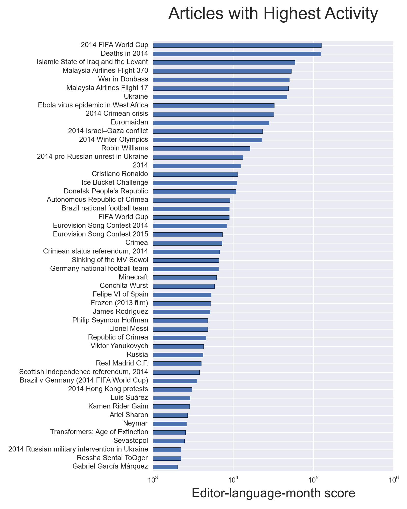
Rather than looking at the breadth of coverage across language versions of Wikipedia, the level of activity on these pages can be used as a metric for ranking. The particular metric I’ll use is the combination of the number of users who edited an article across the months it was in the zeitgeist list, the number of months it was in the zeitgeist list, and the number of languages having the article in its zeitgeist list. So basically (users * months * languages), which produces a large number that can break ties were we to use any single one of the other metrics (like number of languages in the previous figure). The ranking based on this combined activity metric is below and reveals some topics like the World Cup and the deaths of notable people as being consistently interesting topics across time and language (for more on how Wikipedia covers the death of people, see my forthcoming CSCW 2015 paper with Jed Brubaker). The ongoing conflict in the Ukraine is likewise mobilizing sustained and widespread attention focused across several articles (War in Donbass, Ukraine, 2014 Cirmean crisis, Euromaidan, 2014 pro-Russian unrest in Ukraine, etc.) How to aggregate the activity on these different articles related to a similar concept together could be interesting future work.
Now that we have mapped articles to the same topics, we can finally compare languages for the similarity in ranks of their top articles. Permuting over every pair of languages, I compare how similar the ranks of the same articles were: if “Robin Williams” and “2014 FIFA World Cup” were 1 and 2 in English (hypothetically) were they also 1 and 2 in Italian? I use a cosine similarity metric to perform this comparison over the vector of the top 100 articles to produce a symmetric contingency table showing the similarity in rankings for every pair of languages for the two ranking metrics we used above. The columns are ordered by average similarity score: English appears to have the most similar rankings with every other language followed by Russian and Polish while Turkish and Indonesian have very different rankings for their top articles from the rest of the languages.
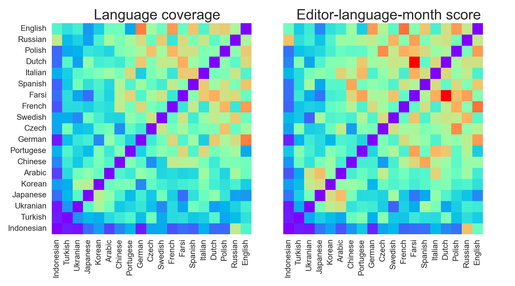
The table below ranks the similarity of language pairs based on the editor-language-month activity score. My folk hypothesis going into this would be that English and German would have the highest similarities in rankings reflecting their shared roles as economic and policy agenda setters in North America and Europe respectively as well as their leadership in many Wikipedia-related matters. But Farsi and Dutch leap out of nowhere to seize a clear lead in having the greatest similarity in rankings — and I don’t have a good explanation for this. Inspecting their respective top lists, it appears both are more cosmopolitan in their orientation to global rather than local news, especially on topics like ISIL, and paying less attention to the Ukranian crisis. Ignoring the Indonesian Wikipedia’s dissimilarity from every other language, we see that language combinations like Ukranian and Swedish and Japanese and Farsi are very dissimilar in their rankings of top stories.
| Highest similarities | Lowest similarities | |||||
|---|---|---|---|---|---|---|
| Language 1 | Language 2 | Cosine Similarity | Language 1 | Language 2 | Cosine Similarity | |
| 1 | Farsi | Dutch | 0.747684 | Ukranian | Swedish | 0.094924 |
| 2 | French | English | 0.639927 | Japanese | Farsi | 0.115249 |
| 3 | Czech | Polish | 0.609603 | Japanese | English | 0.136084 |
| 4 | Polish | English | 0.593232 | Chinese | Czech | 0.160647 |
| 5 | German | English | 0.592578 | Ukranian | Dutch | 0.169325 |
| 6 | Farsi | Russian | 0.587311 | Turkish | Arabic | 0.174961 |
| 7 | Portugese | Farsi | 0.583782 | Japanese | Spanish | 0.175202 |
| 8 | Chinese | Spanish | 0.580538 | Turkish | Ukranian | 0.177230 |
| 9 | Farsi | Italian | 0.570912 | Ukranian | Farsi | 0.181022 |
| 10 | French | Polish | 0.569966 | Turkish | German | 0.186484 |
Comparing across (English) articles
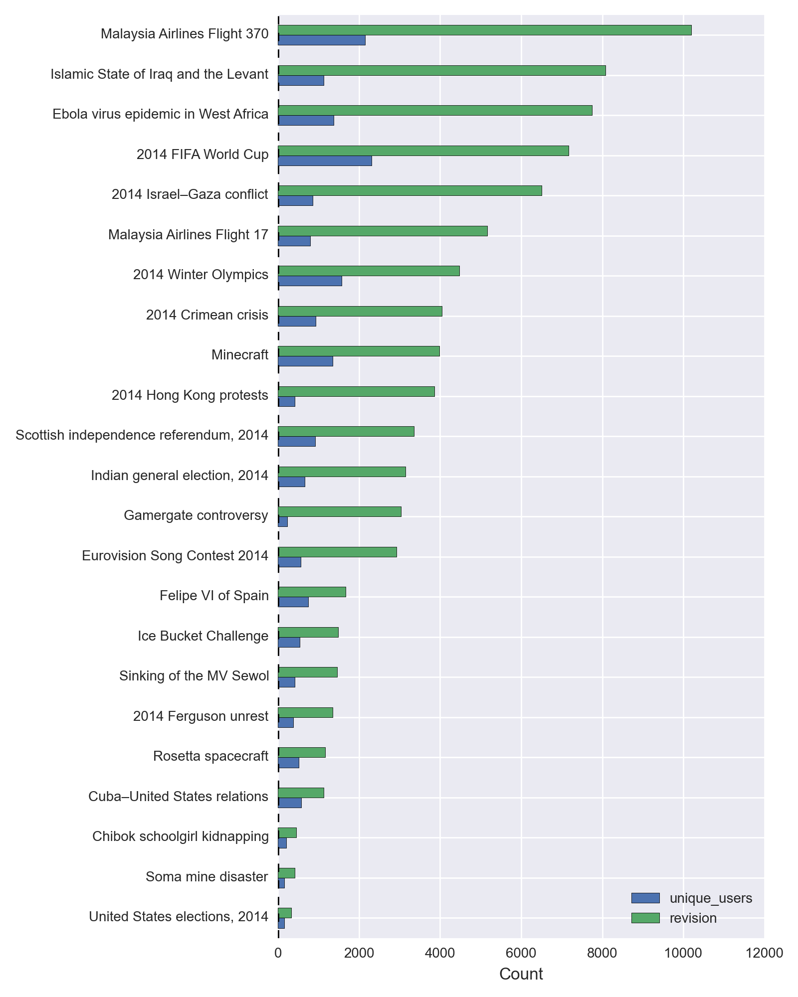
Informed by the “international consensus” of top articles from the analysis above as well as my very imperfect editorial judgment about other topics that have happened since October (remember, the zeitgeist rankings are only available through October at the time of this writing owing to the backlog in parsing the gigantic dump files), I created a list of 23 articles about events in 2014 that includes a mix of international news, domestic US news, as well as science and technology news. My naive goal was to simplify complex events like the Ukrainian crisis by capturing a single article while broadening the scope of the news to include potentially under-represented international (Chibok kidnappings, Sewol sinking, Soma disaster), more recent domestic events (Ferguson protests, Gamergate controversy, US elections), and science & technology stories (Heartbleed bug, Minecraft purchase, Rosetta mission). I’ve also made the decision to exclude deaths (Robin Williams, Philip Seymour Hoffman, etc.) and planned domestic events (Academy Awards, Superbowl, etc.) since these articles either already existed, of limited international interest, or are more predictable. The figure below provides some summary statistics on the number of unique users and revisions made to each of these 23 articles, ranking on the total number of revisions made to these articles between January 1, 2014 and December 22, 2014.
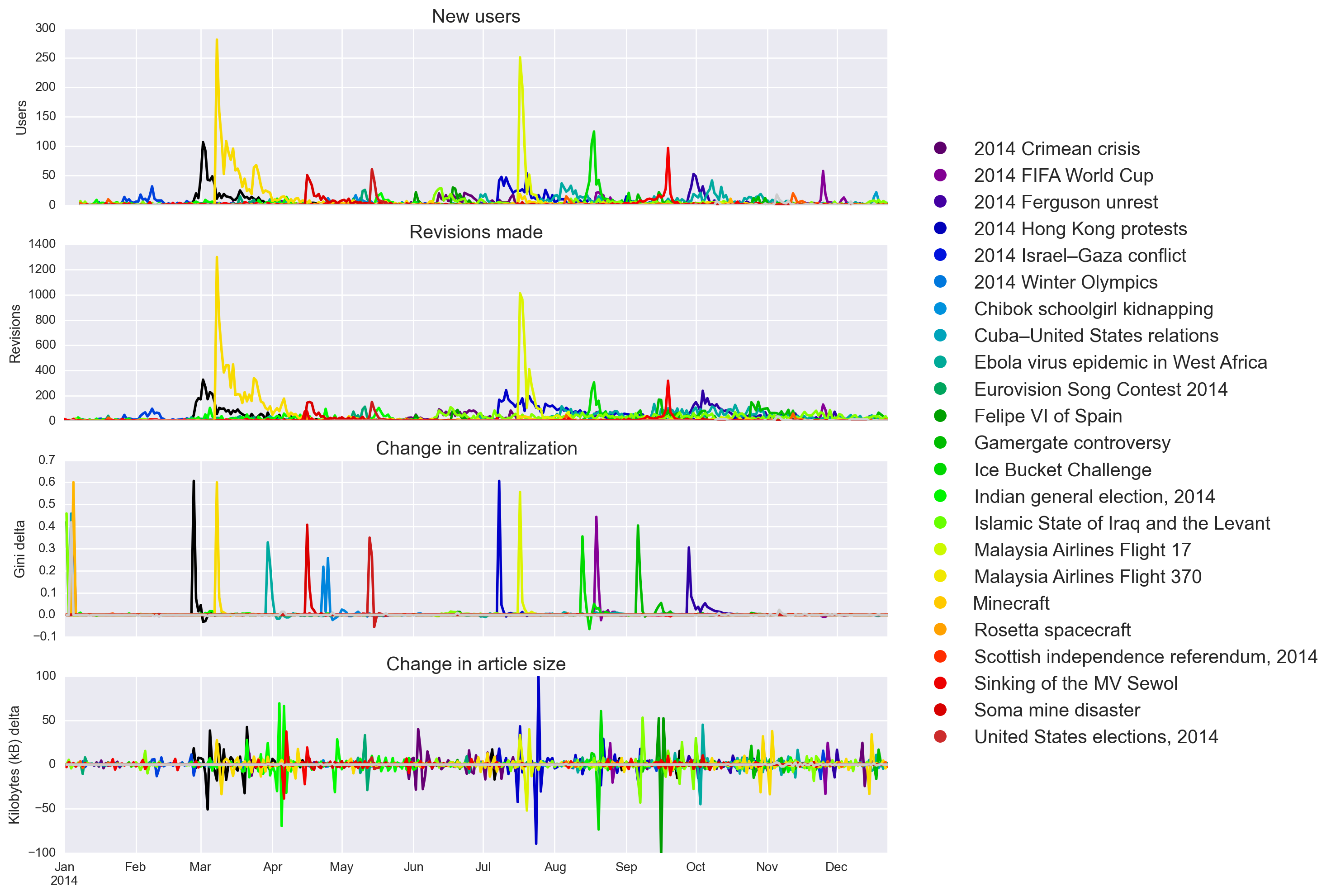
There are a number of features that we can look at for each of these articles to understand how these collaborations unfolded over time.
- The number of users editing on each day reflects both the interest among the editor community as well as the intensity of the coordination challenges the article faces as dozens or hundreds of editors attempt to make changes in the space of a few hours. This is shown in the top subplot in the figure below with articles like Malaysia Airlines Flight 370 and 17 showing clear peaks and rapid fall-offs.
- The second subplot from the top shows the total number of revisions made each day, again the two MA flights show the strongest peaks. Although the number of users and number of revisions tracks each other reasonably well in the bursts around a single event, but the magnitudes are very different: in the extreme cases, several hundred editors make over 1,000 contributions within a single calendar day.
- This invites questions around how equitably the editing work in these collaborations is distributed. I measure this by calculating the changes in the cumulative Gini coefficient of the distribution of editors making revisions: values closer to 0 implies all editors are making equal number of revisions and values closer to 1 implies one editor is making nearly all the contributions. All these articles show a remarkable and immediate centralization of effort almost immediately and what’s remarkable to me is there’s no “relaxation”: this centralization never diminishes over time. In effect breaking news articles look like a handful of editors do most of the work and after they move on, editing patterns remain centralized in other editors.
- Finally, the daily cumulative changes in the article size capture how much content has been added (or removed) from an article on a given day. There’s something surprising to me here because despite the bursts of activity in the top two subplots, there’s no corresponding burst of content generation. This suggests that much of the work in the early hours of these article collaborations are very incremental; changing a few characters rather than authoring whole new sentences or paragraphs. In fact, the peaks of content generation appear to not be strongly correlated with peaks of user or revision activity. This makes some sense — it’s hard to add an entire paragraph to an article when the story is still unfolding and when there are a hundred other articles trying to make changes at the same time.
Below is a sorted table ranked by revisions summarizing the cumulative number of revisions and users as well as the most-recent Gini co-efficients and article sizes for 2014.
| Revisions | Users | Gini | Length | |
|---|---|---|---|---|
| Malaysia Airlines Flight 370 | 10336 | 2145 | 0.72 | 224.72 |
| Ebola virus epidemic in West Africa | 7818 | 1374 | 0.77 | 213.27 |
| Islamic State of Iraq and the Levant | 7545 | 1127 | 0.80 | 232.12 |
| 2014 Israel–Gaza conflict | 6550 | 857 | 0.79 | 247.04 |
| Malaysia Airlines Flight 17 | 5202 | 796 | 0.71 | 140.85 |
| 2014 Crimean crisis | 4271 | 933 | 0.69 | 204.95 |
| 2014 Hong Kong protests | 3852 | 417 | 0.83 | 179.21 |
| Gamergate controversy | 3304 | 233 | 0.82 | 106.95 |
| 2014 FIFA World Cup | 3107 | 2307 | 0.61 | 136.72 |
| Indian general election, 2014 | 2923 | 482 | 0.72 | 189.40 |
| Scottish independence referendum, 2014 | 2374 | 550 | 0.65 | 231.30 |
| Eurovision Song Contest 2014 | 1963 | 277 | 0.70 | 163.46 |
| 2014 Winter Olympics | 1793 | 337 | 0.58 | 96.31 |
| Sinking of the MV Sewol | 1692 | 420 | 0.63 | 150.99 |
| Ice Bucket Challenge | 1647 | 539 | 0.55 | 50.68 |
| 2014 Ferguson unrest | 1483 | 380 | 0.62 | 170.76 |
| Felipe VI of Spain | 1231 | 750 | 0.48 | 34.54 |
| Rosetta spacecraft | 1152 | 218 | 0.50 | 79.15 |
| Minecraft | 900 | 1353 | 0.59 | 111.47 |
| Chibok schoolgirl kidnapping | 865 | 202 | 0.49 | 45.20 |
| United States elections, 2014 | 840 | 156 | 0.44 | 29.64 |
| Soma mine disaster | 634 | 159 | 0.55 | 29.07 |
| Cuba–United States relations | 579 | 573 | 0.44 | 58.26 |
Information consumption patterns
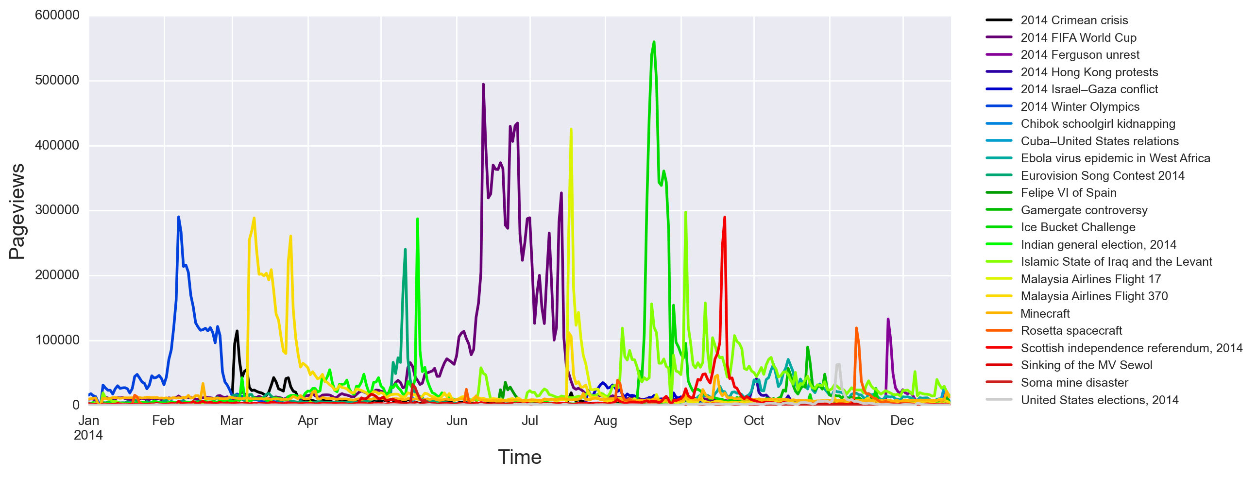
The data above all pertains to the information production side of the equation, but we can also analyze data about information consumption patterns by downloading the pageview information about each of these articles. The figure below plots out the daily pageviews for each of the articles. The large production-side peaks around the two MA flights are less pronounced here and are replaced with peaks for the Winter Olympics, World Cup, and Ice Bucket Challenge. This suggests that there may be a mis-match between the demand for information and supply of volunteers to generate content on the site in response to new events, a question that I’ll get to in a bit.
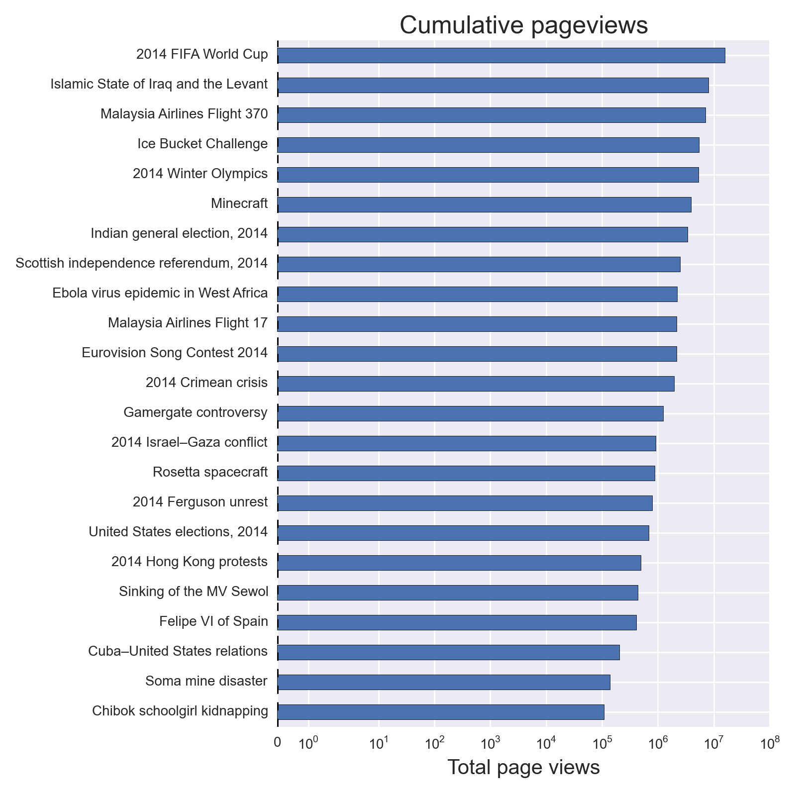
The cumulative number of pageviews gives us another metrics ranking the biggest news stories of the year. Note that the x-axis is log-scaled and these pageviews actually vary over 3 orders of magnitude: the World Cup article received a total of 15 million pageviews in English alone while the Chibok kidnapping article received only a total of 108,700 pageviews.
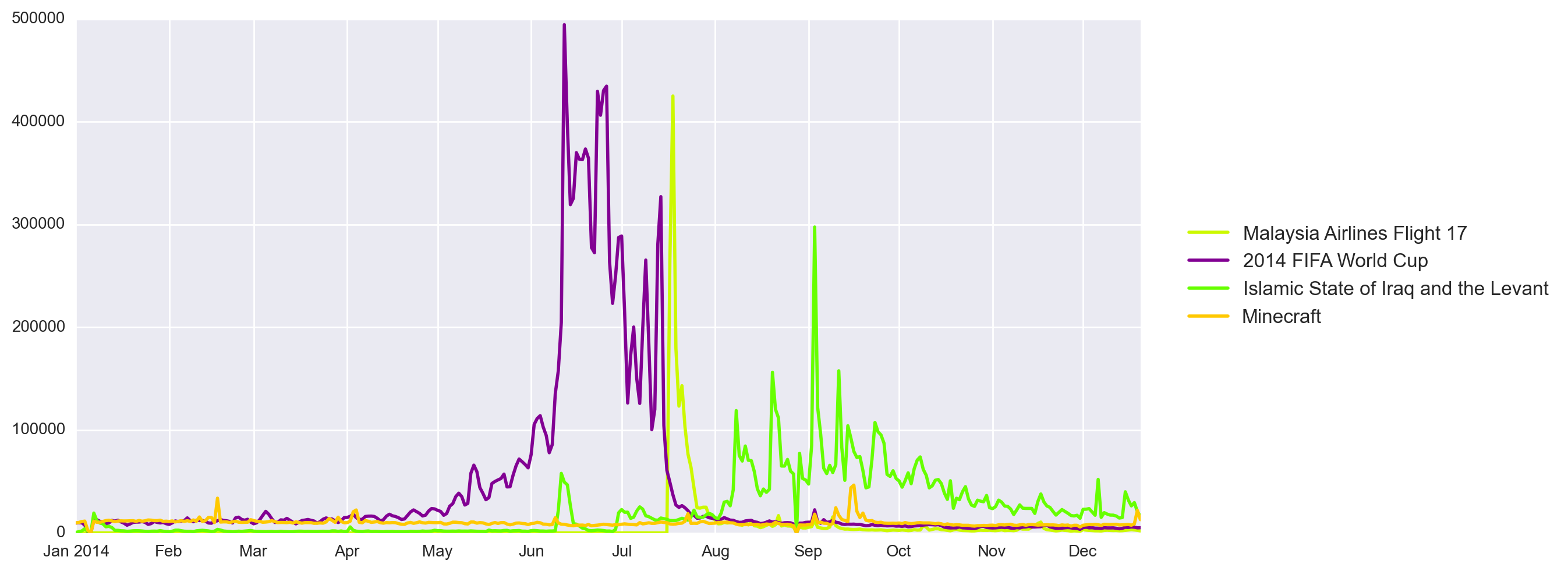
These pageview peaks show some different patterns of attention reflecting the unique nature of each event. The “World Cup” article in purple shows a sudden onset when the event starts in June and sustained attention followed by sudden drop-off after the final matches in July. Contrast this with the article for the MA17 article (yellow) that has rapid onset and fall-off with no sustained attention and the ISIL article (green) that is characterized by a repeated series of bursts and slower fall-off in attention than the other articles. Finally, the “Minecraft” article only shows a small burst of attention in September following the announcement of its purchase by Microsoft but actually has larger daily levels of attention on average than any of the other articles.
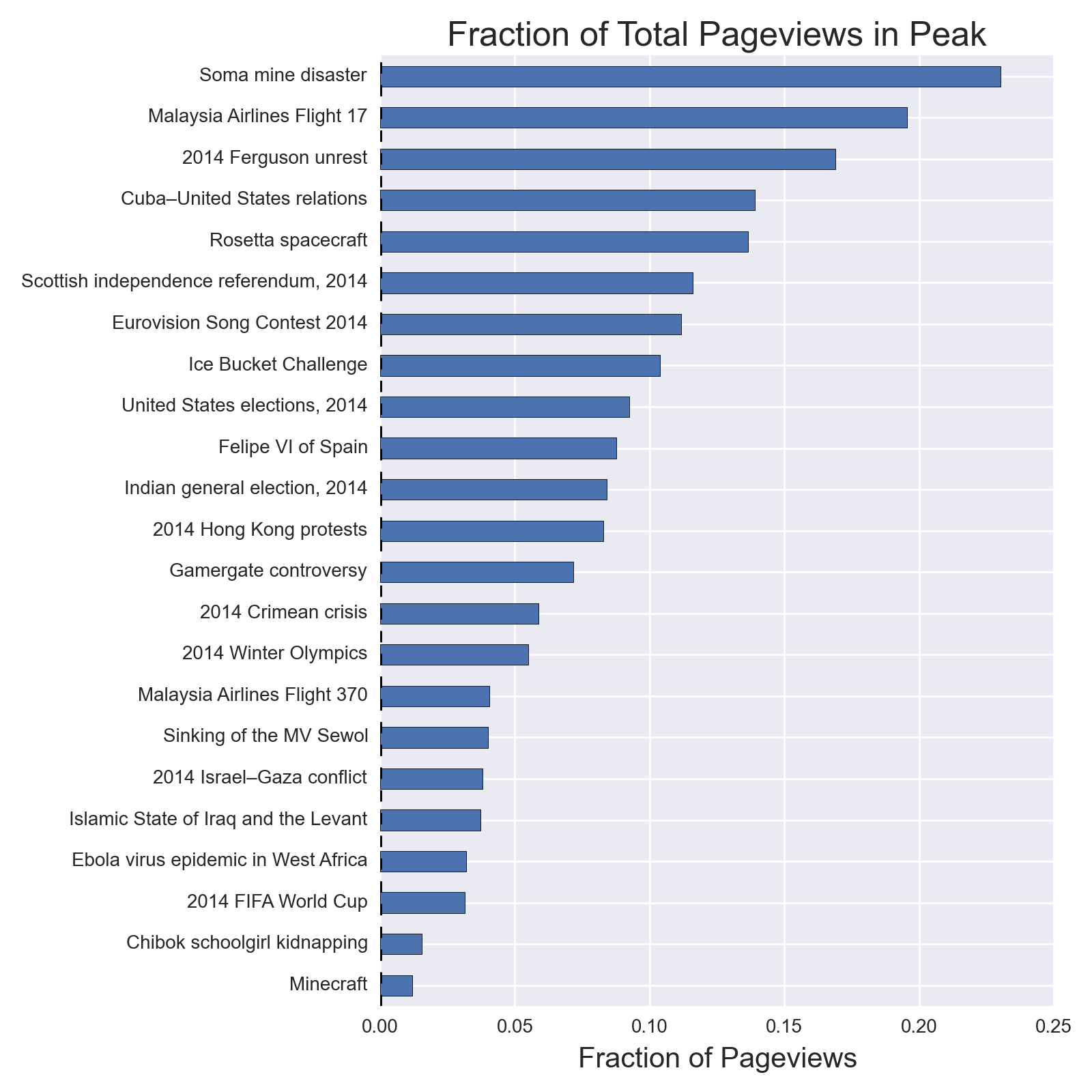
Related to this idea of different classes of burstiness, another metric I can use is what fraction of the pageviews over the year occurred on the day with the maximum pageviews. In other words, which articles were “one hit wonders” that received a lot of attention on one day but no other days? Almost a quarter of the pageviews that the Soma mine disaster article received since the May accident happened on a single day versus the Minecraft article receiving only 2% of its total pageviews this year following the announcement of its purchase.
This variability in the “spikiness” of attention to different kinds of news events raises the question of how efficiently do Wikipedia editors supply revisions in response to demand for information? I’m using the number of revisions as a coarse measure of information production despite the fact that our analyses above showed that many of the revisions during the biggest editing days are very small contributions. However, if Wikipedia is able to meet demand for information by mobilizing editors to supply additional revisions, I would expect that the distribution of points should fall along a diagonal: a standard deviation more in pageviews is matched with a standard deviation more of revisions. The figure below is a scatter plot of all the (standardized) daily pageviews and revision counts for each article on each day of this year. In the upper-right are the articles at times they’re “under stress” with large deviations in attention and collaboration and in the lower-left are the articles under “normal behavior.”
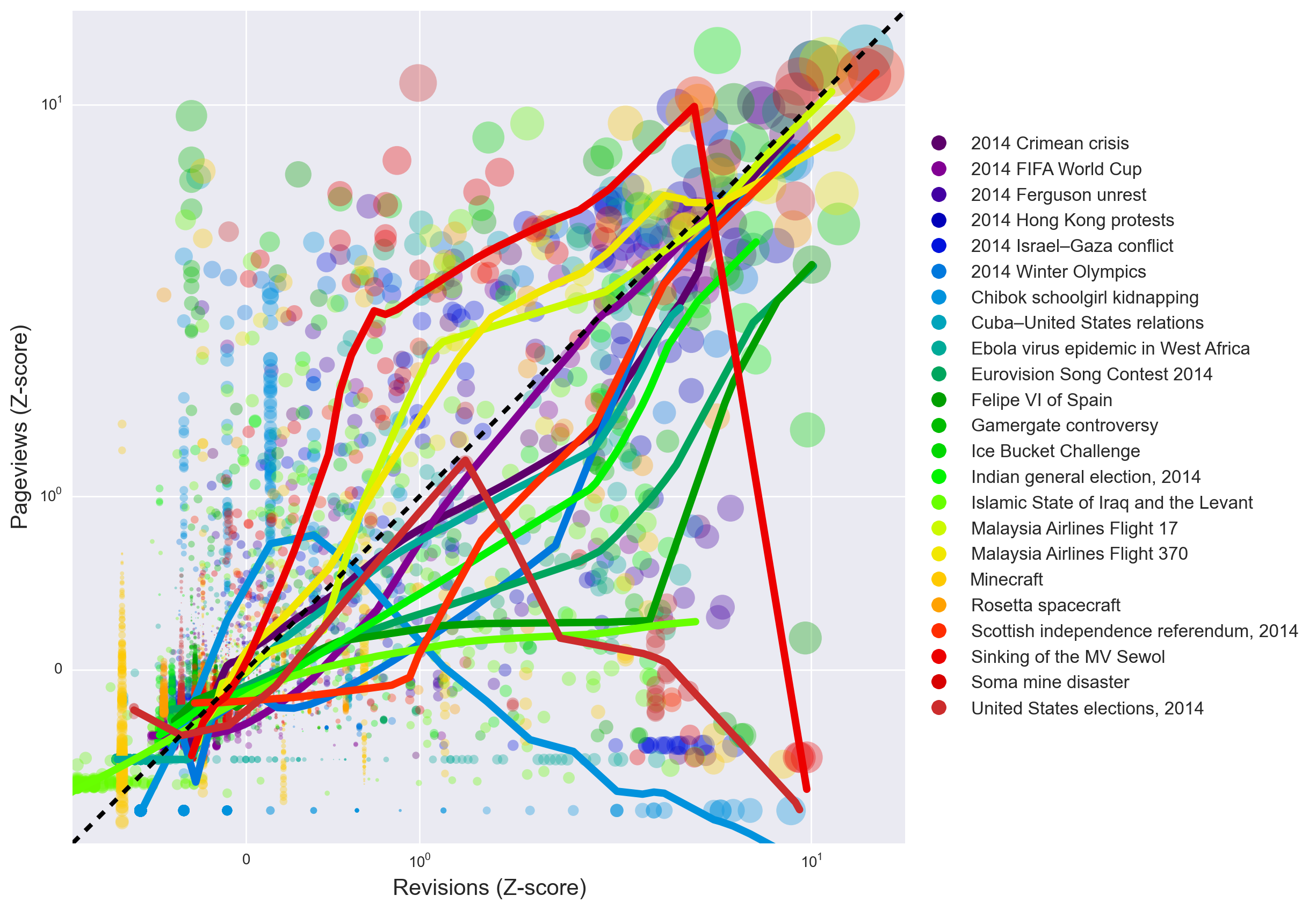
I’ve fit LOWESS lines (solid colored lines) to the points to capture different kinds of variation throughout the distribution, but despite the apparent dispersion in the data, there is a strong relationship along the diagonal across many articles. But several articles (US general elections, MV Sewol, and Chibok kidnapping) show a different pattern where revisions to the article out-pace attention to the article. This suggests that the matching hypothesis holds for most articles and Wikipedia is able to meet increased “demand” for information with proportional increases in the “supply” of revisions. Furthermore, using the diagonal as a crude boundary to split this sample of articles into two classes, there’s some interesting variation in articles’ post-burst behavior. Regression lines falling above the diagonal reflect articles where there’s more post-burst attention (pageviews) than post-burst production (revisions). Conversely, regression lines falling below the diagonal reflect articles where there’s more post-burst information production than demand. The articles about the MA flights and Ice Bucket Challenge fall into the former class of articles where Wikipedians are unable to meet demand while most other articles reflect Wikipedians lingering on articles after popular attention has moved on. If Wikipedia contains a set of “ambulance chasing” editors who move from news story to news story for the thrill or attention, who — if anyone — stays behind to steward these articles?
Collaboration network
The data about who edited what articles can be converted into a bipartite network. In this network there are editor nodes, article nodes, and links when an editor made a contribution to an article. The large red nodes are the articles and the smaller blue nodes are the editors. What’s remarkable is that despite the diversity in topics and these events unfolding at different times over an entire year, this network is a giant component in which every node is indirectly connected to each other. Each breaking news collaboration is not an island of isolated efforts, but rather draws on editors who have made or will make contributions to other articles about current events. In effect, Wikipedia does in fact have a cohort of “ambulance chasers” (pictured at the center) that move between and edit many current events articles.
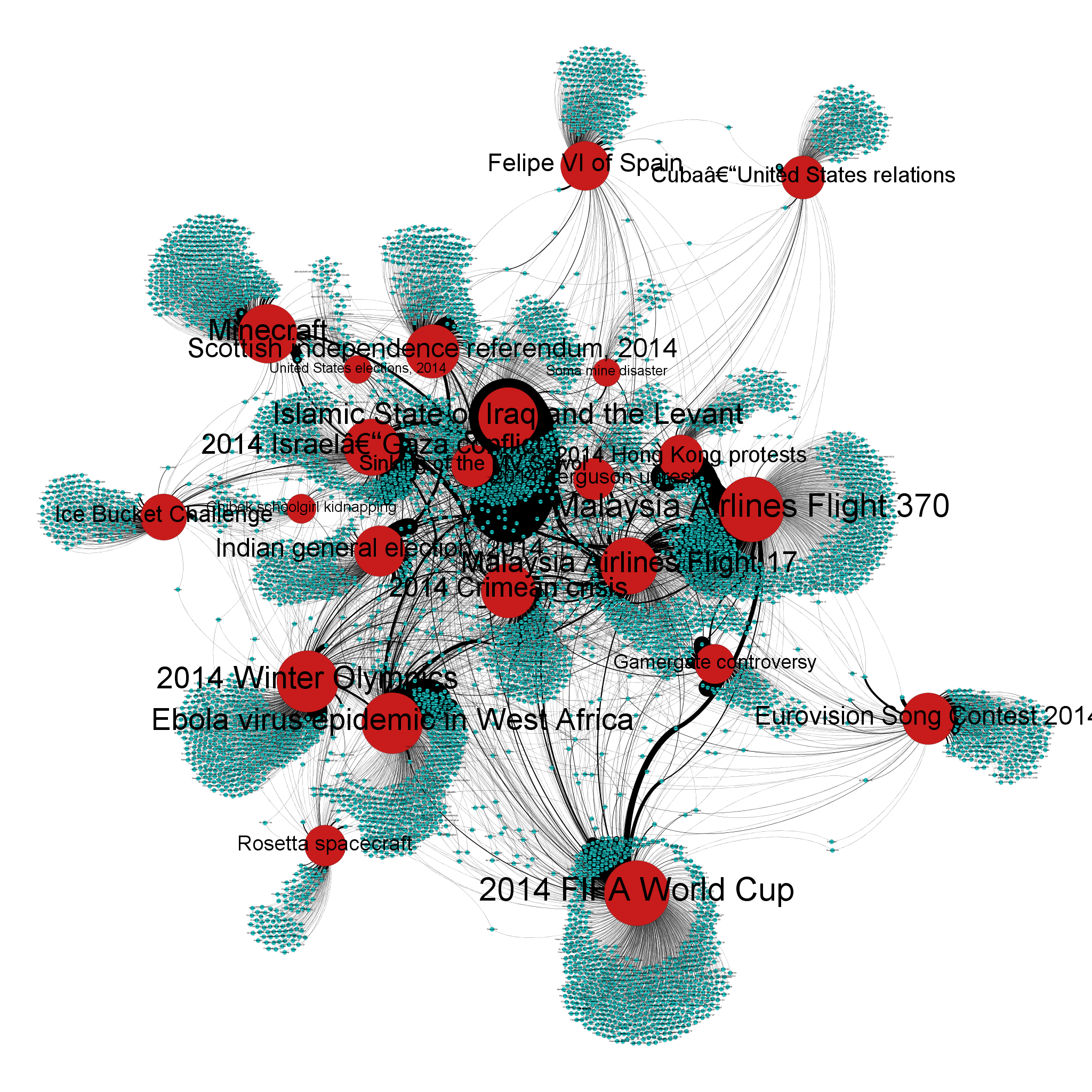
The analysis above pointed out that editors’ contributions to these articles are extremely unequal: Gini coefficients near 0.8 for many articles which reflects an incredible level of centralization. Below is a list of editor-article pairs with the greatest number of revisions. Keep in mind that Wikipedia editors follow the 80-20 rule with the vast majority of editors making fewer than 10 contributions and the top editors making hundreds of thousands of contributions. This level of activity on a single article within the course of a single year reflects a remarkable investment of effort, which may become problematic if these editors believe they “own” an article and act to sideline others’ contributions.
| Article | User | Revisions | |
|---|---|---|---|
| 0 | Islamic State of Iraq and the Levant | P-123 | 2385 |
| 1 | Ebola virus epidemic in West Africa | BrianGroen | 1374 |
| 2 | 2014 Hong Kong protests | Signedzzz | 893 |
| 3 | Malaysia Airlines Flight 370 | Ohconfucius | 773 |
| 4 | Ebola virus epidemic in West Africa | Gandydancer | 709 |
| 5 | 2014 Hong Kong protests | Ohconfucius | 668 |
| 6 | Gamergate controversy | Ryulong | 565 |
| 7 | Indian general election, 2014 | Lihaas | 505 |
| 8 | Gamergate controversy | NorthBySouthBaranof | 496 |
| 9 | Scottish independence referendum, 2014 | Jmorrison230582 | 473 |
But this looks at all the editing activity across the entire year — what about focusing on editing happening around the event itself? Are these collaborations just as cohesive and indirectly connected in the 24 hours preceding and 24 hours following the day with the peak amount of pageview activity in the year? Very much yes: these collaborations are still connected together by a cadre of editors who respond to breaking news events within days, or even hours. Previous work I’ve done has shown that these giant components emerge within hours as “ambulance chasing” editors show up to coordinate work on current events articles. The “aftermath network” below has 2158 nodes and 2508 connections in contrast to the 6171 nodes and 7420 edges in the complete collaboration network from above, so it’s smaller but still indirectly tied together through editors brokering between multiple article collaborations.
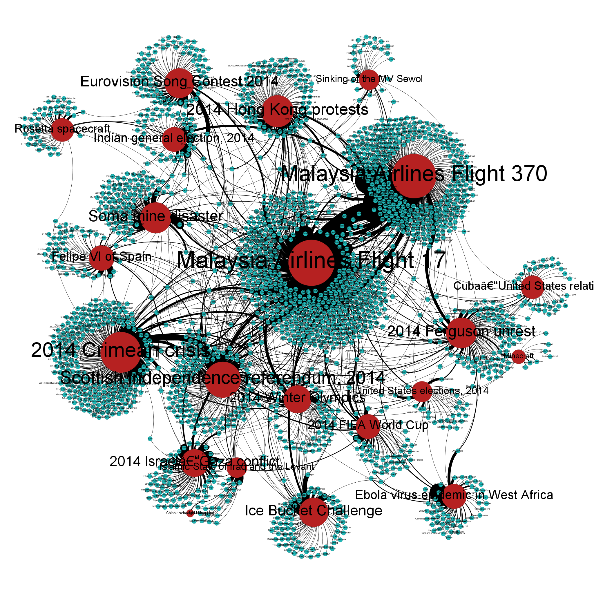
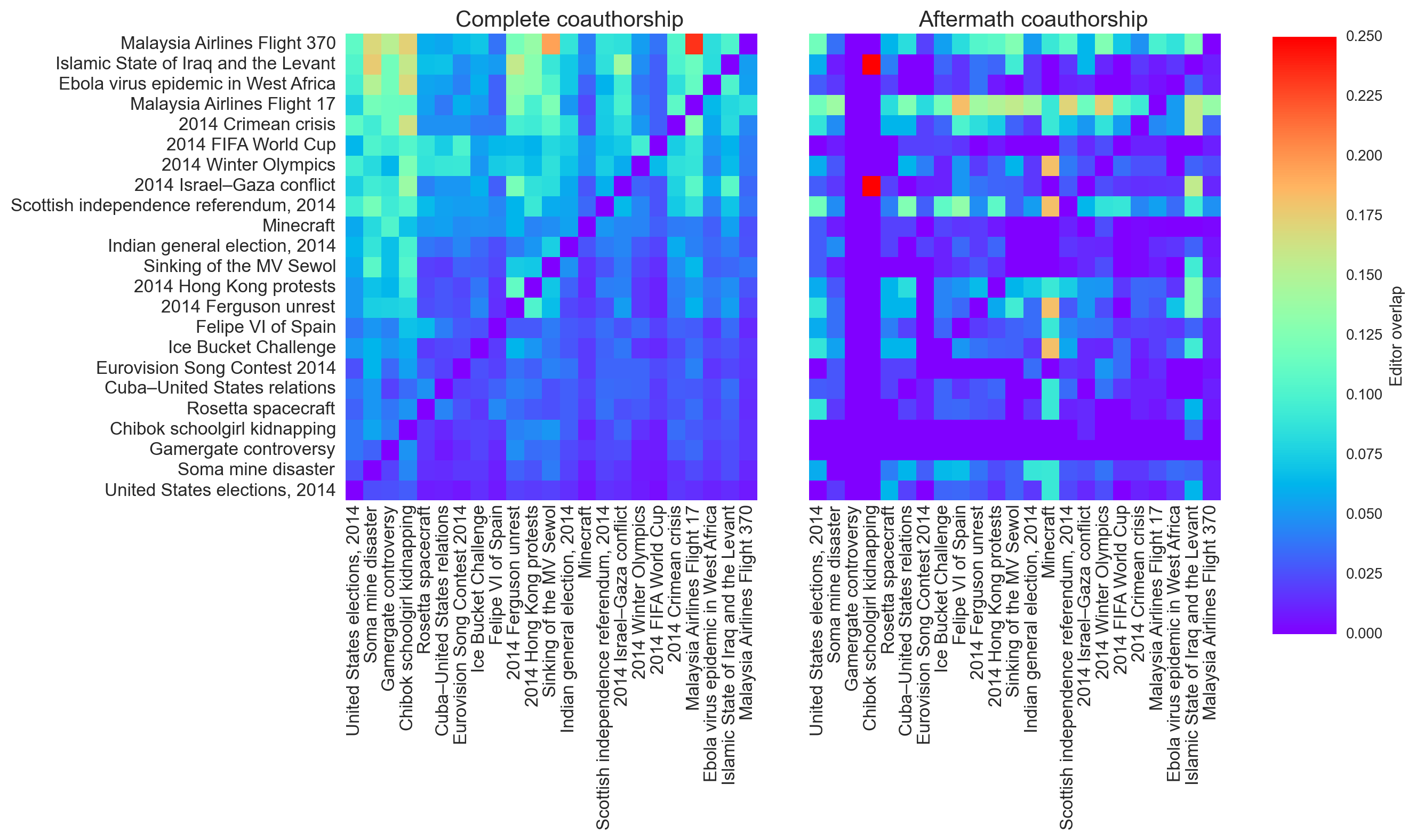
Some of these highly-connected users in the center are actually automated scripts called bots that specialize in copyediting or vandalism fighting, but these aren’t the only multi-article editors either. It’s also not the case that every editor is contributing to every article in this corpus. I can also plot the similarity between articles based on the overlaps in editors who show up to edit them. The figure below has two other contingency tables that plot the fraction of overlapping editors between each pair of articles for the complete (left) and aftermath (right) coauthorship graphs. The y-axis is ranked by articles that show the largest average overlap with MA Flight 370 having more of its editors overlapping on other articles and the US elections article having negligible overlap. The two MA flights show nearly 25% of their editor cohorts overlap, with some sizable overlaps with the Sewol sinking.
But comparing these similarities to the aftermath authorship, a different story emerges. Take the two MA flight articles, for example. Around 25% of the MA17 editors overlapped with the MA370 editors by the end of the year, but 48 hours after MA17 was shot down, there was only around 10% overlap in their respective populations of ambulance chasers. This suggests the migration of editors from one article to another may actually be relatively slow as the emergence of overlaps between these articles happens outside of this aftermath window. Rather the overlaps in the aftermath window seem to be partially attributable to the coincidence of these events within weeks of each other: ambulance chasing editors in March are still chasing ambulances in April, but not in September as they move onto other topics or stop editing Wikipedia.
Conclusions
What were the top news stories in 2014 as judged by Wikipedia editors and readers? Looking across multiple languages as well as a variety of metrics of information production and consumption, no single topic stands out but a few consistently appear at the top. The World Cup, Malaysia Airlines flights, Ukrainian crises, and ISIS all had wide coverage and high levels of activity across languages, dominating other major stories like the West Africa Ebola outbreak, Israel-Gaza conflict, or protests in Hong Kong. However, there was substantial variation in the editorial attention to these topics as well as the existence of articles about these topics across many languages. But topics like the World Cup and Ukrainian crises had several related articles in the lead which leads me to believe these were the two biggest stories of 2014. Focusing on the English Wikipedia, the production of information was highly concentrated in time and editors, the growth of these breaking news articles happened well after peak attention to them. Despite the variability in attention to these articles over the year, Wikipedia appears to be able to mobilize editors to make revisions that scales with the demand for information and the editors writing these articles have substantial overlap with one another.
The question of “what is news?” has consumed professional newspaper editors and journalism scholars for decades. One attempt at an answer is a framework called “news values” that can be traced back to a 1965 paper by Johan Galtung and Mari Ruge that explored how 12 factors influence whether foreign events were picked up by domestic news sources. Galtung and Ruge argue that events most likely to become news are (1) more immediate (frequency), (2) more intense (threshold), (3) less ambiguous (equivocality), (4) more relatable to the audience (meaningfulness), (5) more foreshadow-y (consonance), (6) more rare (unexpectedness), (7) less temporary (continuity), (8) more related to other issues (composition), (9 & 10) more oriented to the powerful (elite reference), (11) more person-level, and (12) more negative. Other journalism scholars have since followed up to this study and offered alternative factors like entertainment. I’ve also written about how Galtung and Ruge’s news values map onto Wikipedia policies governing the notability on what kinds of events can or cannot have articles. I leave it as an exercise to the reader to map these values onto the top stories this year.
There are many ways by which the most “important” news of this year can be measured using behavioral data from Wikipedia editors and readers. The top stories identified by the various methods above vary in how they map to these various news features: the Malaysian Airlines flights had immediate consequences, intense loss of life, were very unexpected, and negative. MA17 brought the on-going Ukrainian conflict back into the news as well as invoking the loss of elite AIDS researchers but MA370’s location and cause of disappearance remain highly uncertain. Many of topics may be “pseudo-events” with little lasting historical impact: the 2011 Royal Wedding was one of the biggest stories using the zeitgeist rankings, but has marginal enduring importance. It’s also important to remember that Wikipedia’s coverage of these topics is filtered through the existing news values and gatekeeping processes as editors have to source their content to coverage from traditional news organizations.
This analysis is far from the final word on the subject of Wikipedia and current events. There are alternative identification strategies that could be employed to select news articles: the Current Events portal, In the News template, 2014 category, and pageview dumps each would uncover alternative news topics. I also haven’t performed any content-level analyses of the kinds of content, topics, or other textual features that changed in these articles over time. News events involving topics that already have existing articles also provide a nice source of exogenous variation for natural experiments around peer effects in attention, for example. Certainly the biases and differences in behavior between these countries cannot be definitely attributed to features of a particular national culture, only the peculiarities and biases of each respective Wikipedia community. Given the difficulties Wikipedia faces in recruiting and retaining new editors, these current events might also provide a template for understanding how to match novice and expert users to tasks. Finally, the correspondence between Wikipedians’ activity on articles with major news stories of the year suggests that Wikipedia article behavior might have predictive validity for box office revenues, disease forecasting, and potentially many other topics. All without having to go begging organizations to share their data 😉