A network analysis of Bob Ross's paintings
While it makes me look like I’m stalking him, Walt Hickey is doing some of the more fun data analysis on the new FiveThirtyEight. His recent April 13 article examined features from the entire canon of Bob Ross paintings and he happily made this data available within days. The data is stored as a rectangular matrix of episodes or pieces by rows and the specific features as columns. A piece like “Mountain-By-The-Sea” from Season 9, Episode 12 is coded as containing 10 features: “beach”, “bushes”, “clouds”, “cumulus”, “deciduous”, “mountain”, “ocean”, “snowy mountain”, “tree”, and “waves”.
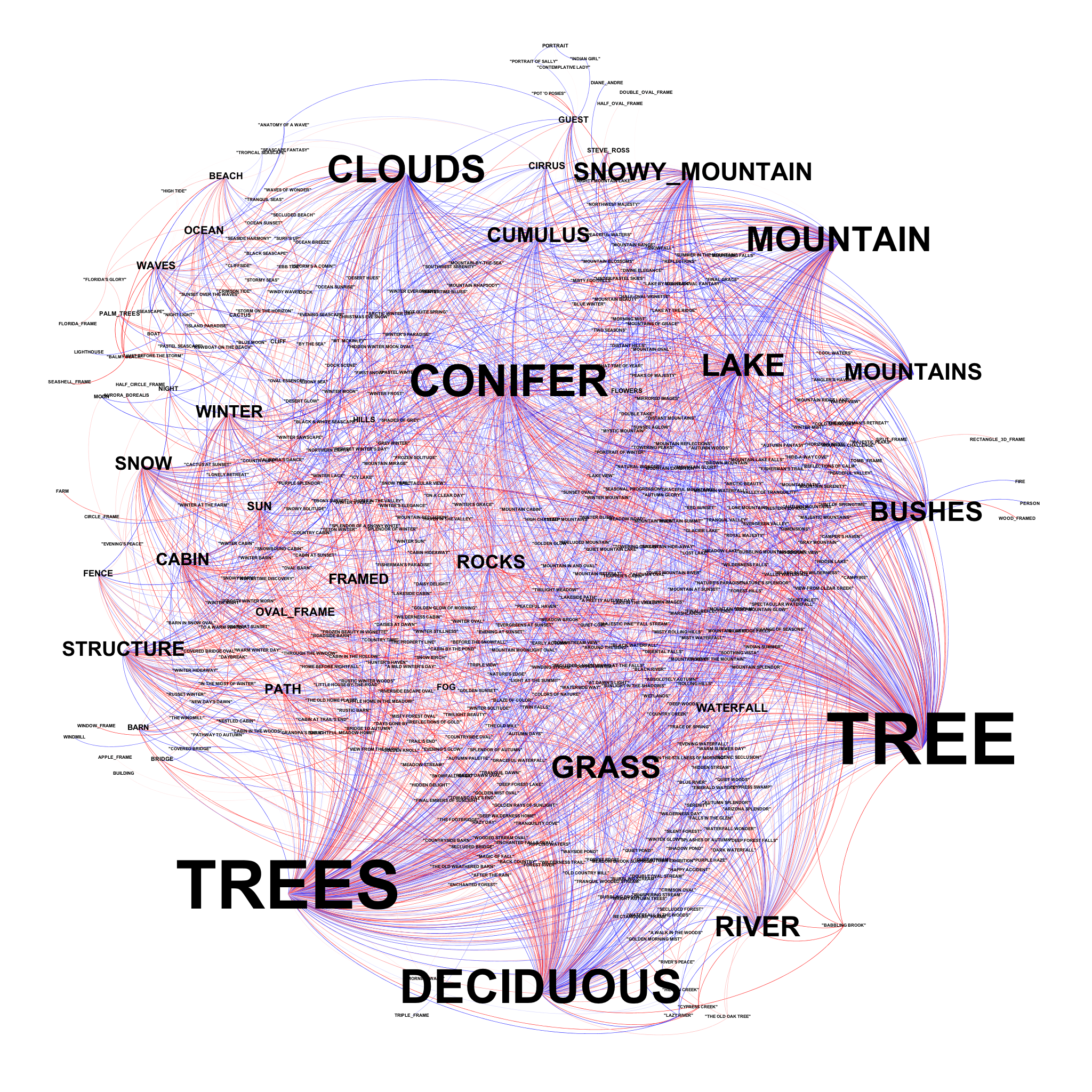
To a network scientist like me, this is a common way of storing relationships. We typically imagine social networks as people connected to other people via friendship links, but we can also create many other kinds of networks like people connected to employers or the ingredients contained within recipes. These latter two networks are called “bipartite networks” because they involve two distinct types of nodes (people and employers, ingredients and recipes). We can create a bipartite network of paintings from Hickey’s data where a painting is connected to its features and these features are in turn shared with some other paintings. In the figure below, we can see that some features like trees are highly central (bigger text meaning more paintings having that feature). Conversely, features like “beach”, “ocean”, or “waves” are more peripheral on the upper left.

For example, while the “Mountain-By-The-Sea” is described by the 10 features mentioned above, other paintings share some of these same features. There are 26 other paintings such as “Surf’s Up” and “High Tide” also contain “beach” features, and these beach-related paintings also have other features that they share in common with still other paintings. But “Mountain-By-The-Sea” is indirectly connected to “Mountain In and Oval” via “bushes”.
Performing a mathematical operation to convert the bipartite network into a more traditional network, we can connect these paintings directly to each other if they share a feature in common. In addition to having “bushes” in common, “Mountain-By-The-Sea” and “Mountain In and Oval” also have “clouds”, “cumulus”, “deciduous”, “mountain”, and “tree” in common. The mathematical operation assigns the relationship between “Mountain-By-The-Sea” and “Mountain In and Oval” a score of 6 because they share 6 features in common.
While Ross was a prolific painter, we well know that some features like trees occur more often than others. As a result, almost every painting is connected to every other painting by at least one feature, which isn’t terribly interesting to visualize as it would be a big “hairball.” Instead, we can take advantage of the fact that paintings have different levels of similarity to each other. We’ll use the SBV backbone algorithm developed by some of my network science colleagues at Northeastern University to extract only those relationships between paintings that are particiularly interesting and then visualize the resulting network.
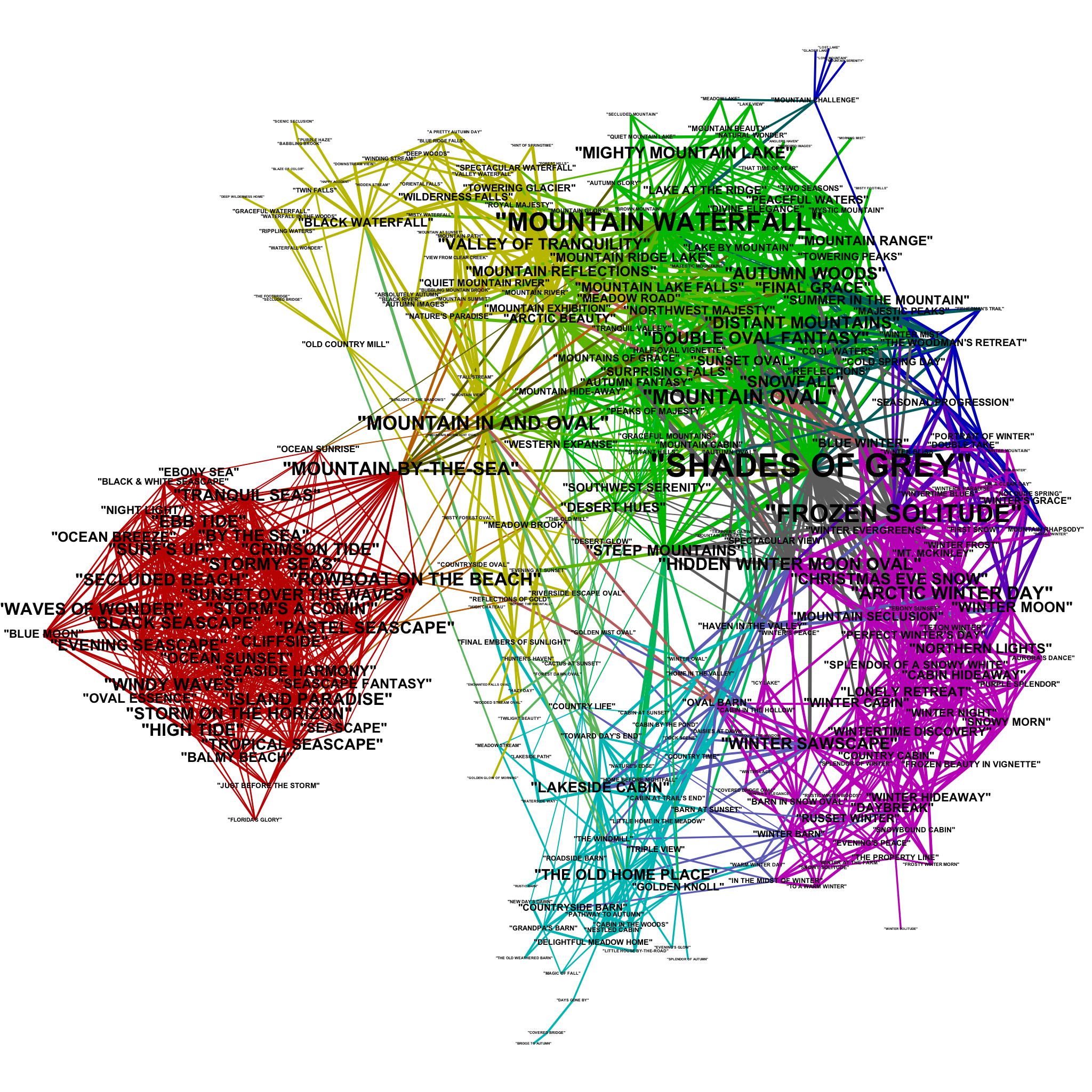
Using an excellent network visualization tool called Gephi, I layed the network out and colored it below. Again, a painting (represented as a label below) is connected to another painting if they both share features in common. The SBV algorithm removed some links that should be present, but we can interpret the remaining links to be the “most important” links. I then used Gephi’s modularity function to discover “subcommunities” within this network that are highly similar to each other. These communities are represented by the six colors below.
- Red These are ocean scenes which are not unusual in Ross’s repertoire — there are many paintings in here — but they share few features with other paintings in his oeuvre. Note that “Mountain by the Sea” is one of the three paintings that connect this group back to the rest.
- Yellow These are the “waterfall” paintings.
- Green These are the “mountain” paintings.
- Purple These are the “snow” paintings.
- Light blue These are the “homes” paintings.
- Dark blue Something of a catchall.

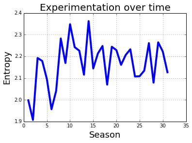
We can also compute the “entropy” of all the features Ross used in a given season. Entropy is a way of measuring how disorganized a system is; in our case, how many times each feature appears in a season. If the same features we used exactly once, then the entropy would be 0. If different features were used different amounts, then the entropy would be high. Basically, entropy is another way of measuring how experimential or diverse Ross’s work was in a given season by how many different features he used.
The first two seasons have very low entropy, suggesting a very conservative approach. Season 3 and 4 see a drastic departure in style and much higher entropy (more experimentation) before falling again in Seasons 5 through 7 to a more conservative set of features again. Season 8 shows another surge in experimentation — different features being used in different amounts during the season. Season 13 shows some retrenchment back to more conservative habits followed again by a more experimental season. But in general, there’s a pattern of low entropy in the early years, a middle period of high levels of experimentation, followed in the later years by a consistent but moderate level of differentiation.

The full code for my analysis of Hickey’s data is on GitHub.